Hi, I'm Wanying.
Product Designer focused on AI-native systems
I design how AI behaves inside professional tools.
I turn language-driven generation into structured, user-governed systems.
Beyond design, I build and ship AI-powered applications independently, bridging product thinking and technical execution.
Systems
Practice
- 01Designing AI-native editor systems where language becomes structured, editable interfaces.
- 02Defining human-controlled generation workflows that balance automation, transparency, and performance across scalable formats.
PageOn: Designing AI-Assisted Creation with Clarity and Control
Overview
About PageOn
PageOn is an AI-native content creation platform built around structured human–AI collaboration. Rather than treating AI as a one-step generator, the system was designed to orchestrate multi-stage creation—translating language prompts into structured, modular, and editable visual compositions. My focus was on designing the underlying creation architecture: balancing automation with user control, transparency, and authorship across the entire workflow.
PageOn introduction video
Project Type
AI Product Design · System Design · UX Research · Interaction Design
My Role
Lead Product Designer, responsible for the end-to-end creation experience across onboarding, editor, AI interaction, and design systems.
Scope & Ownership
- Defined system-level design direction for AI-assisted creation
- Designed and iterated core editor interactions and control mechanisms
- Shaped AI integration without undermining user authorship
- Validated improvements through repeated user testing and task-based evaluation
Team Context
Lean cross-functional team (~15 people). As the sole designer, owned the end-to-end creation system and worked closely with founders and engineers to define direction, validate assumptions, and iterate on system-level decisions.
Project Summary
Problem
AI made content generation easy, but made user intent and control harder.
- Users had highly diverse presentation goals
- AI output was fast, but often misaligned
- Lack of clarity reduced trust and iteration confidence
Case 01 — Onboarding
The core challenge
PageOn serves users with highly diverse presentation needs.
Role
Elementary Teacher
Teacher
A teacher preparing slides for elementary students needs content that is visually engaging, age-appropriate, and easy to understand. Their presentations must capture young attention spans while conveying educational concepts clearly. The design needs to be colorful, playful, and structured to support learning objectives.
“Focuses on clarity and engagement—making complex ideas accessible through visual storytelling.”
Key Insight
A teacher preparing slides for elementary students, a marketing manager launching a product, a graduate student defending research, and a consultant delivering strategic recommendations may all be "creating a presentation," but their intent, constraints, and success criteria are fundamentally different.
This created a central challenge:
AI could generate content, but struggled to reliably infer user intent without explicit guidance.
Without addressing this, generation risked being fast but misaligned.
Strategic Response
Clarifying Intent
Make goals explicit early. We prioritize clarity and alignment to ensure every design decision maps back to core project objectives.
Execution Details
- Define audience, outcome, and scope
- Align on structure before content
- Prevent misalignment before generation
“Onboarding shifted from prompting to alignment.”
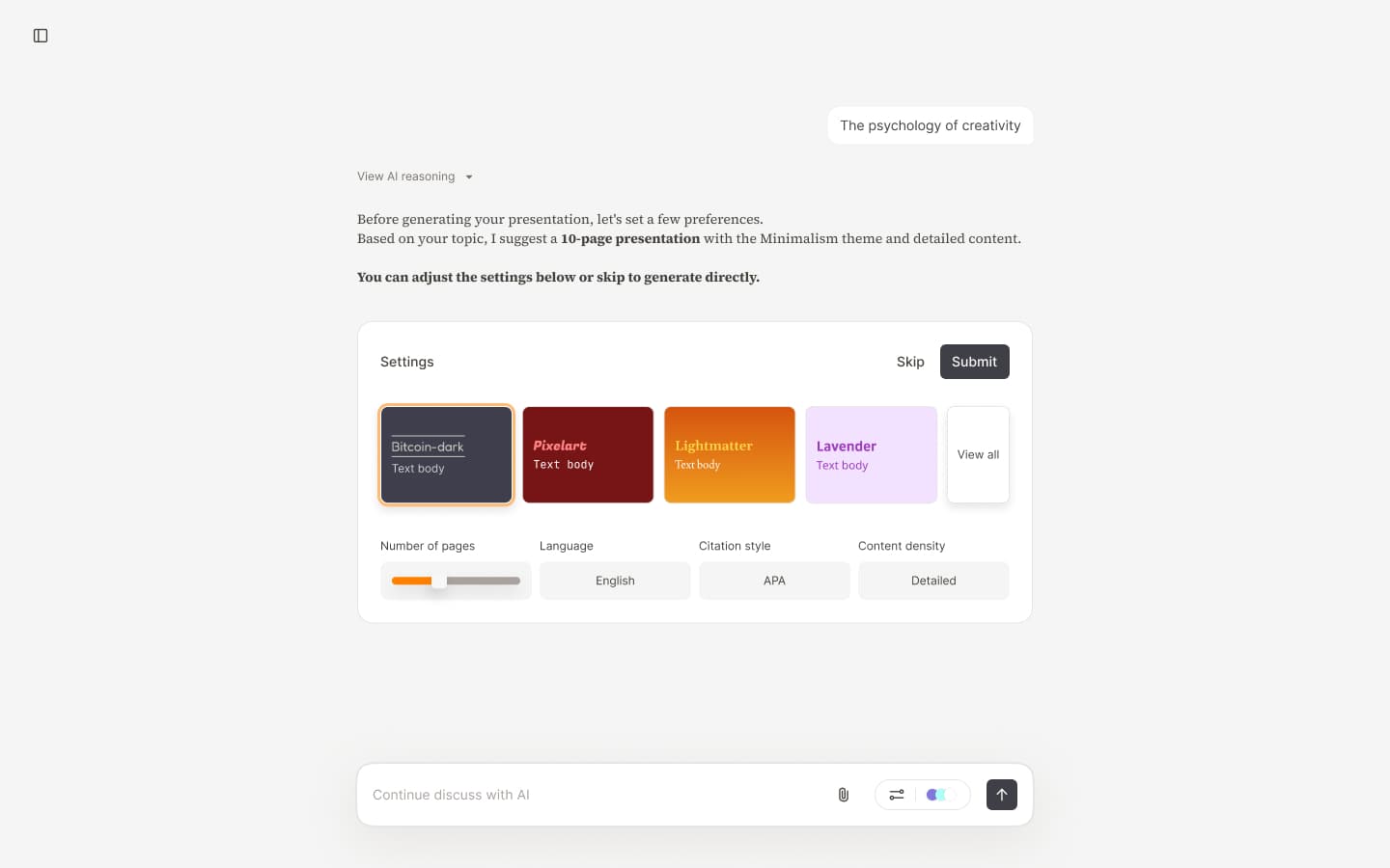
AI Plan Settings - Step 0: Initial setup—control from the start, guiding users to input intent accurately
Earning Trust
Make AI work legible. We prioritize clarity and alignment to ensure every design decision maps back to core project objectives.
Execution Details
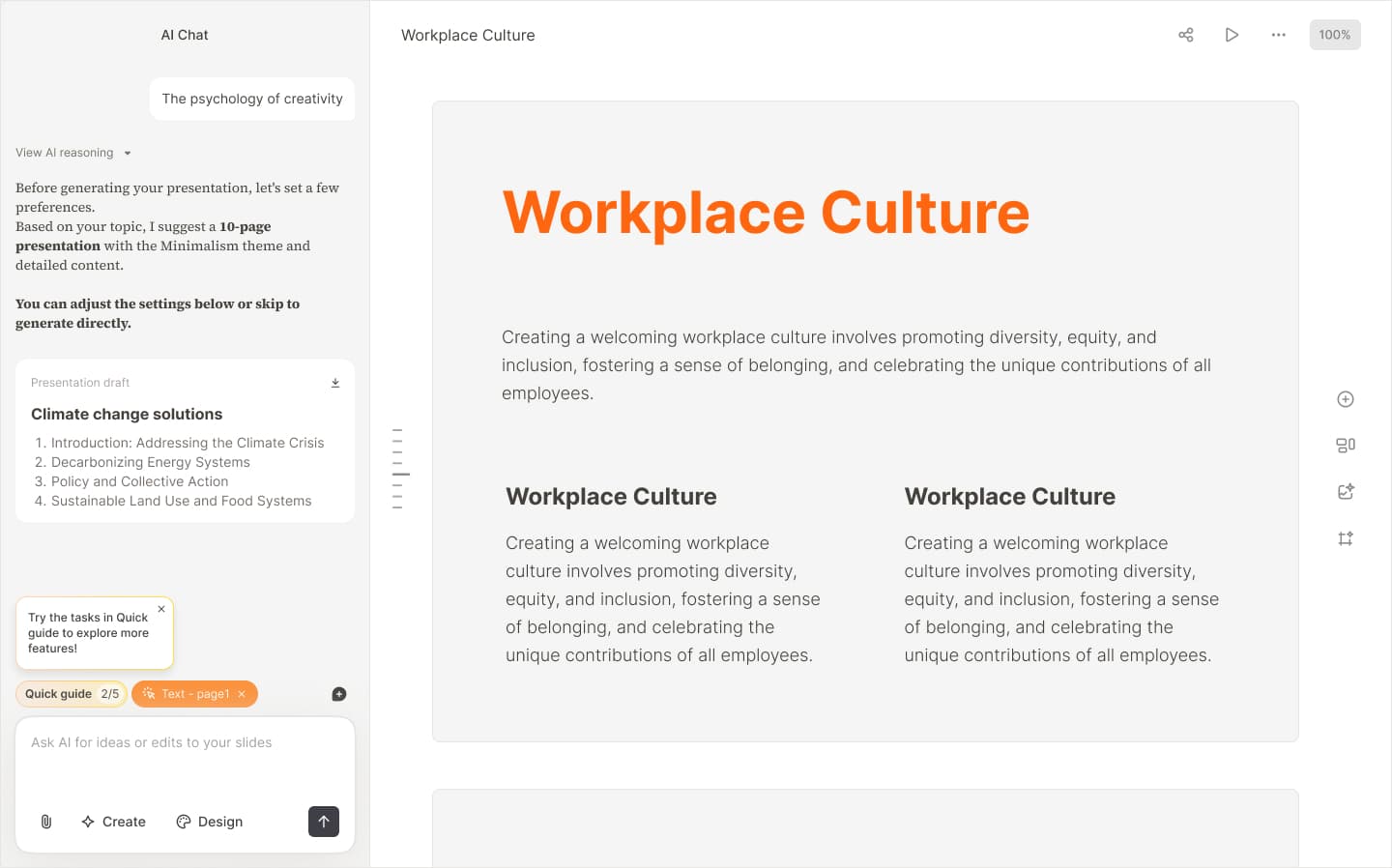
- Expose the full generation flow
- Show quality before commitment
- Let users edit AI decisions
“Trust formed when users could see and steer outcomes.”
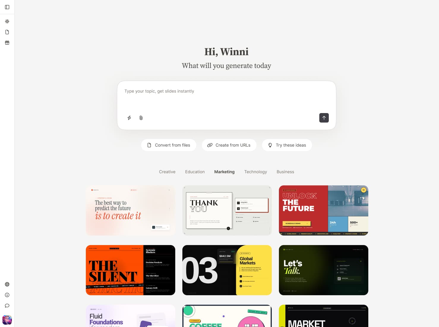
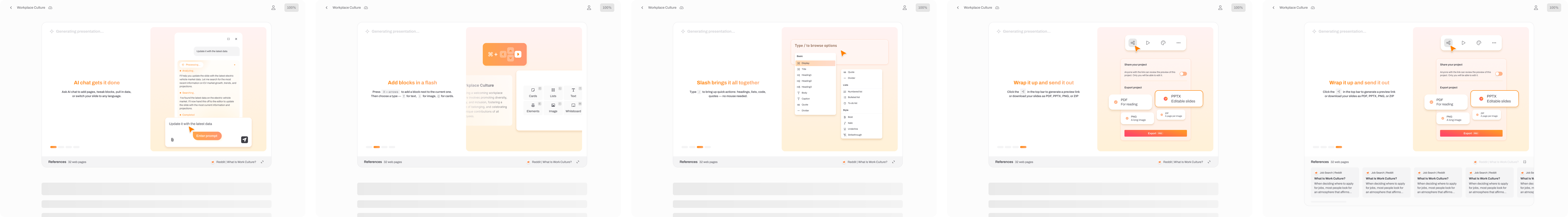
First screen showcases what we can deliver—capturing interest and sparking the urge to create.
Stating Constraints
Support value-aware choices. We prioritize clarity and alignment to ensure every design decision maps back to core project objectives.
Execution Details
- Make limits and costs visible
- Guide deliberate usage choices
- Bring pricing into the workflow
“Usage felt intentional because constraints were explicit.”
Stating Constraints - Part 1: Post-generation prompt guiding users for the best experience
Why this structure mattered
Together, these three elements shaped a clear mental model:
- 01AI does not "guess" intent—it collaborates on it
- 02Trust is earned through visible outcomes, not promises
- 03Constraints guide better decisions rather than limiting creativity
This foundation reduced early confusion and set clearer expectations for the rest of the creation workflow.
Case 02 — Theme Iterations
Evolving themes from static parameters to AI-driven design systems
As content quality improved, visual consistency and flexibility became increasingly critical.The challenge was no longer whether themes looked good, but whether they could scale across diverse contexts, audiences, and intents—without sacrificing readability or control.
Over time, the theme system went through five major iterations.
Iteration 1 — Manual theme design
The initial theme system was completely manual. We designed themes one by one, creating a total of 6 themes. Each theme required designers to manually select fonts, colors, and image styles—no automation or parameter swapping. Visual styling was defined by a small set of parameters: Background, Headings, Blocks, Supporting elements, but every design decision was made by hand.
Theme Iteration 1 - Manual design exploration: designers hand-selecting fonts, colors, and image styles for individual themes.
Iteration 2 — Color mapping system
To scale theme creation, we listed all color-dependent elements and mapped them to 5 color categories. This color mapping system enabled rapid theme generation: with just a set of 5 colors, we could create new themes instantly. We expanded from 6 themes to 20. While Iteration 1 only covered light themes, this system allowed seamless expansion to dark themes and beyond. Users could also customize their preferred themes by modifying the 5 colors directly in the theme editor.
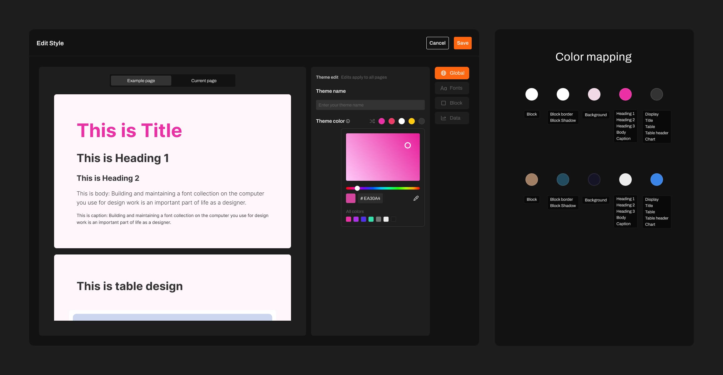
Theme Iteration 2 - Color mapping system overview: all color-dependent elements categorized into 5 color groups.
Iteration 3 — Structured color systems and expanded parameters
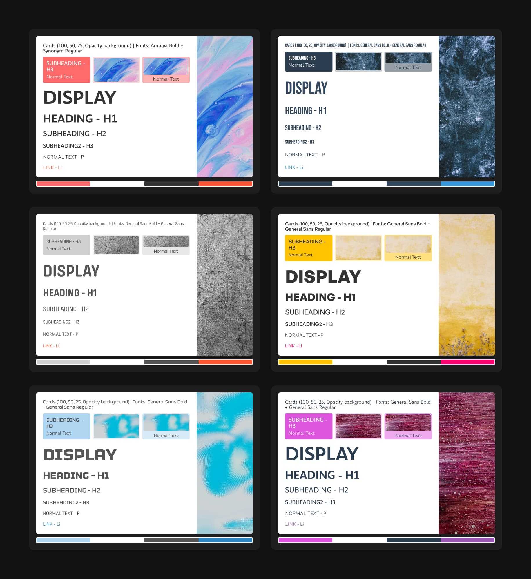
To improve quality and scalability, the third iteration rethought themes as a structured color system, inspired by Material UI's color builder. The system introduced color roles (primary, secondary, tertiary, neutral), tonal ranges, and explicit foreground-background relationships to ensure readability and visual harmony.
Controllable parameters expanded significantly—text colors, backgrounds, interactive states, placeholders, tables, and system components. Each UI element mapped to a specific role, allowing consistent adaptation across the interface. A seed color enabled users to adjust one input and have the entire palette update harmoniously, establishing systemic visual consistency.
Theme Iteration 3 - Demonstrating how Material UI's theme builder works and its core principles.
Iteration 4 — AI-driven theme generation and fine-grained control
User feedback revealed a gap: the system assumed uniform aesthetics, but needs varied dramatically. The fourth iteration fundamentally changed themes by moving from predefined rules to AI-driven orchestration, introducing new dimensions like glow and gradients, and enabling dynamic theme generation.
Users could ask AI to: Apply glowing text effects, change heading typography, adjust visual tone across the entire presentation in real time. AI became responsible for coordinating an expanded and flexible parameter space, while users retained the ability to refine outcomes at a granular level. This transformed themes from static presets into a co-created visual system.
Theme Iteration 4 - Demonstrating different themes, each with personalized design styles beyond simple value mapping. Some themes include textures or decorative effects, while others don't—all decisions are made by AI based on what each theme needs. This approach unleashes AI's creative potential to design autonomously.
Product-wide refactor: Skill-Driven Agentic Architecture
To maximize AI's capabilities, we refactored the entire product—architecture, UI, and how AI works. We integrated MCP, Call tools, and skills to help AI deliver better results.
To align with this decision, we narrowed the boundaries of user editing, as editing features can constrain AI's creative potential. This strategic trade-off prioritizes AI-driven creation over manual customization. We transitioned from manual co-creation to a Skill-Driven Agentic Architecture, where AI orchestrates specialized subagents and professional knowledge to deliver high-fidelity results.
Presentation generated after unleashing AI capabilities: Japanese Language First Class Deck – Swiss International
Case 03 — Agent Architecture
This section emerged from our shift from strong editing to weak editing, which required a comprehensive refactor of both architecture and UI. The first task was designing Skill—but I quickly realized this couldn't be solved through design alone. Understanding the overall system architecture was essential. So I analyzed the complete architecture first, then redesigned Skill's position within it.
System Architecture: The 7-Layer Blueprint
The architecture follows a layered design that separates user configuration, intelligent routing, external data, internal knowledge, and professional execution. This ensures AI output is controllable, standardized, and consistent with professional standards.
Intent-to-Output: The User Journey
Mode Selection
Users start by selecting an Expert Mode (e.g., Academic, Visual, Analysis). Each mode activates a specific set of Skills and Subagents tailored to the domain.
Expert Modes
Click a mode to enable, expand to see MCP and skills.
This is not vibe coding. I redesigned the Skill, MCP, and Subagent architecture to ensure these roles operate effectively in the application and deliver higher-quality presentation outputs.
Future Expansion Scenarios
This methodology is built for parallel expansion. Each scenario is an independent track we can activate as needs emerge.
Enterprise
AI-powered analysis and creation from enterprise documents and data, with strict confidentiality controls.
Validation & Reflection
From Iteration to Evidence
After shipping the 2.0 iteration, I conducted structured user validation to evaluate whether the redesigned workflows meaningfully improved clarity, efficiency, and AI reliability. The goal was not to confirm assumptions, but to measure behavioral change, perceived value, and system trust across real usage scenarios.
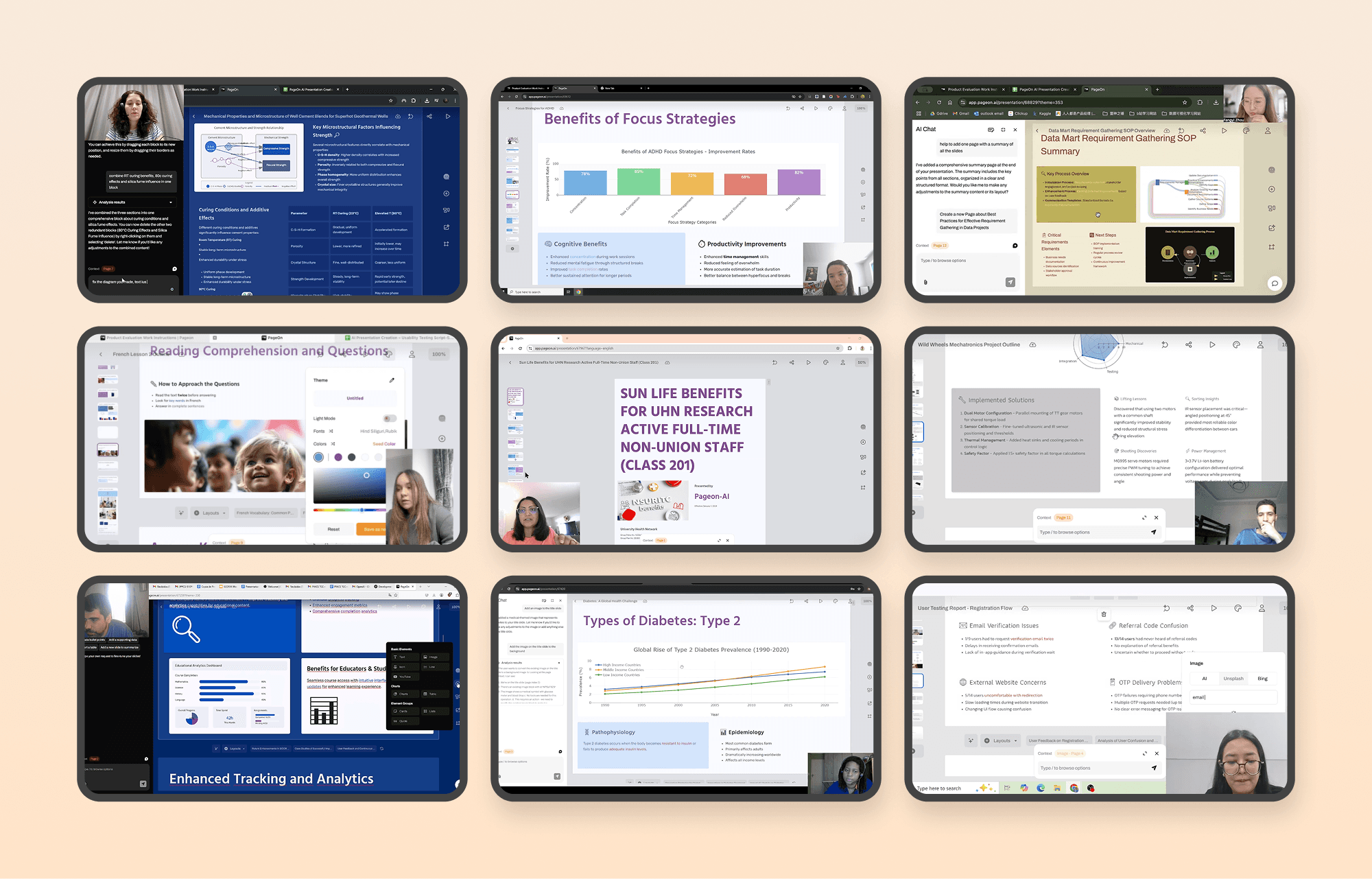
User search video screenshot
Core Improvements & Impact
The product evolved from a tool users struggled to navigate into a system they actively rely on and seek to optimize — evidenced by a 17.35% satisfaction increase, the dominance of positive feedback, and a behavioral shift toward efficiency-driven usage.
Overall User Satisfaction
Shift from “barely acceptable” to “actively appreciated”.
Value Recognition
Positive feedback is the dominant category, reflecting a transition to “expecting refinement”.
Qualitative Shifts
User feedback indicates a fundamental transition from basic usability hurdles to efficiency-focused workflows.
Task Clarity
Improved information architecture and predictability led to smoother task flows.
AI as Core Tool
AI shifted from a novelty feature to an embedded production necessity.
User Behavior
Users now use exploratory language like "let try" and "maybe", signaling trust.
Optimization Focus
Feedback now targets shortcuts and bulk actions—power user behavior.
Future Considerations
Layer 1 — System Foundation
Build trust through reliability and predictability. Ensure the system behaves consistently, transparently, and recoverably, reducing uncertainty in AI-driven workflows.
Layer 2 — AI Evolution
Transform AI from generation to collaboration. Increase transparency and controllability so users move from guessing system behavior to confidently co-creating with it.
Layer 3 — Workflow Maturity
Unlock professional-grade efficiency. Enable power users to accelerate production through intelligent shortcuts, structured onboarding, and workflow optimization.
Additional Work
Product Guidance
While your slides are being generated, explore these tips to learn more about the product and make the most of your experience.
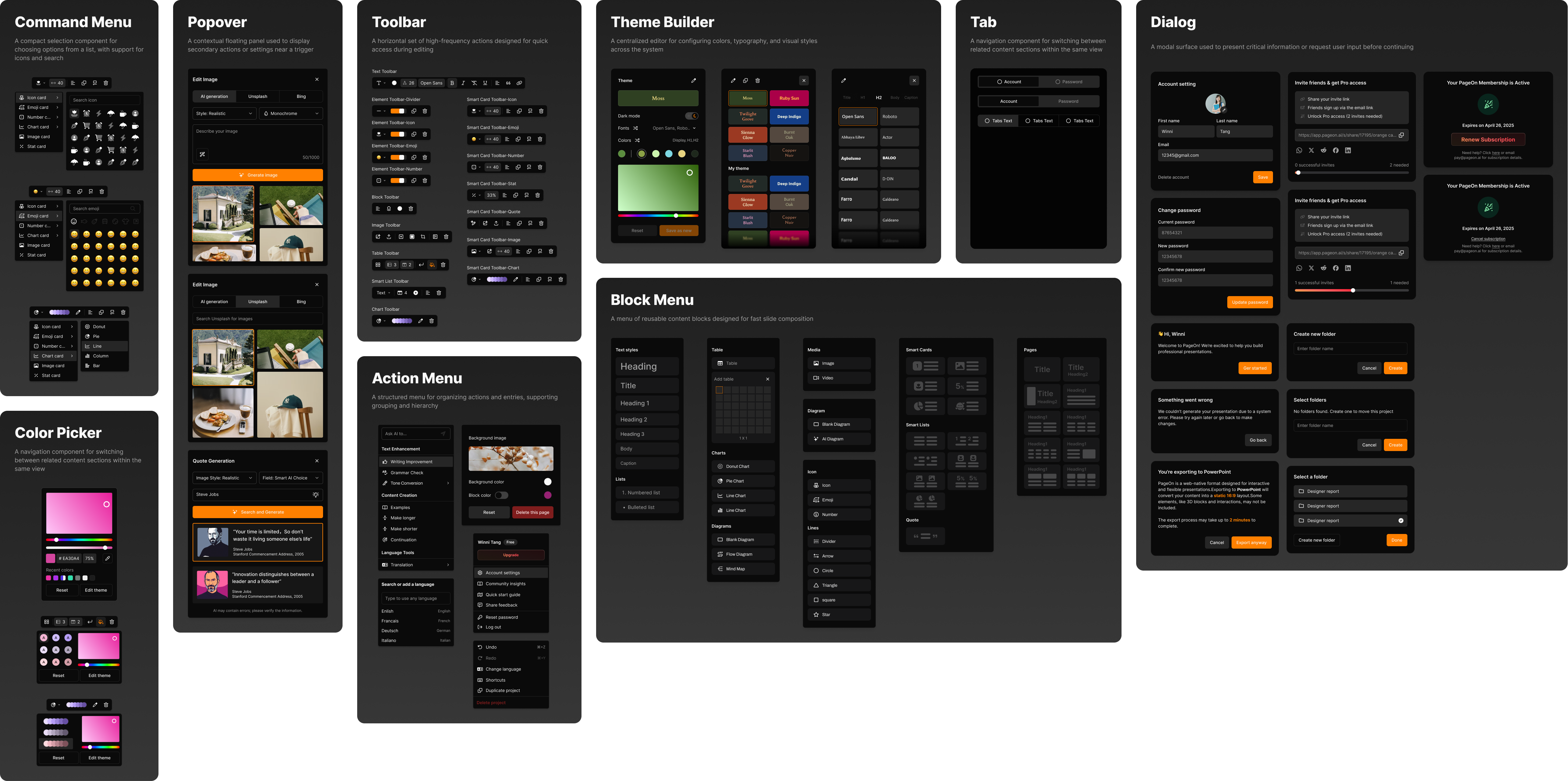
Design System
An extension of the design system based on shadcn, adapted to meet our specific business needs.
Logo Design
The Pageon logo draws inspiration from the core concepts of 'chat' and 'P', composed entirely of basic geometric shapes. This minimalist approach creates a simple yet distinctive mark that is highly adaptable across various applications and merchandise. The modular nature of the foundational shapes allows for seamless extension to peripheral products while maintaining visual consistency. The result is a memorable identity that balances simplicity with visual interest.
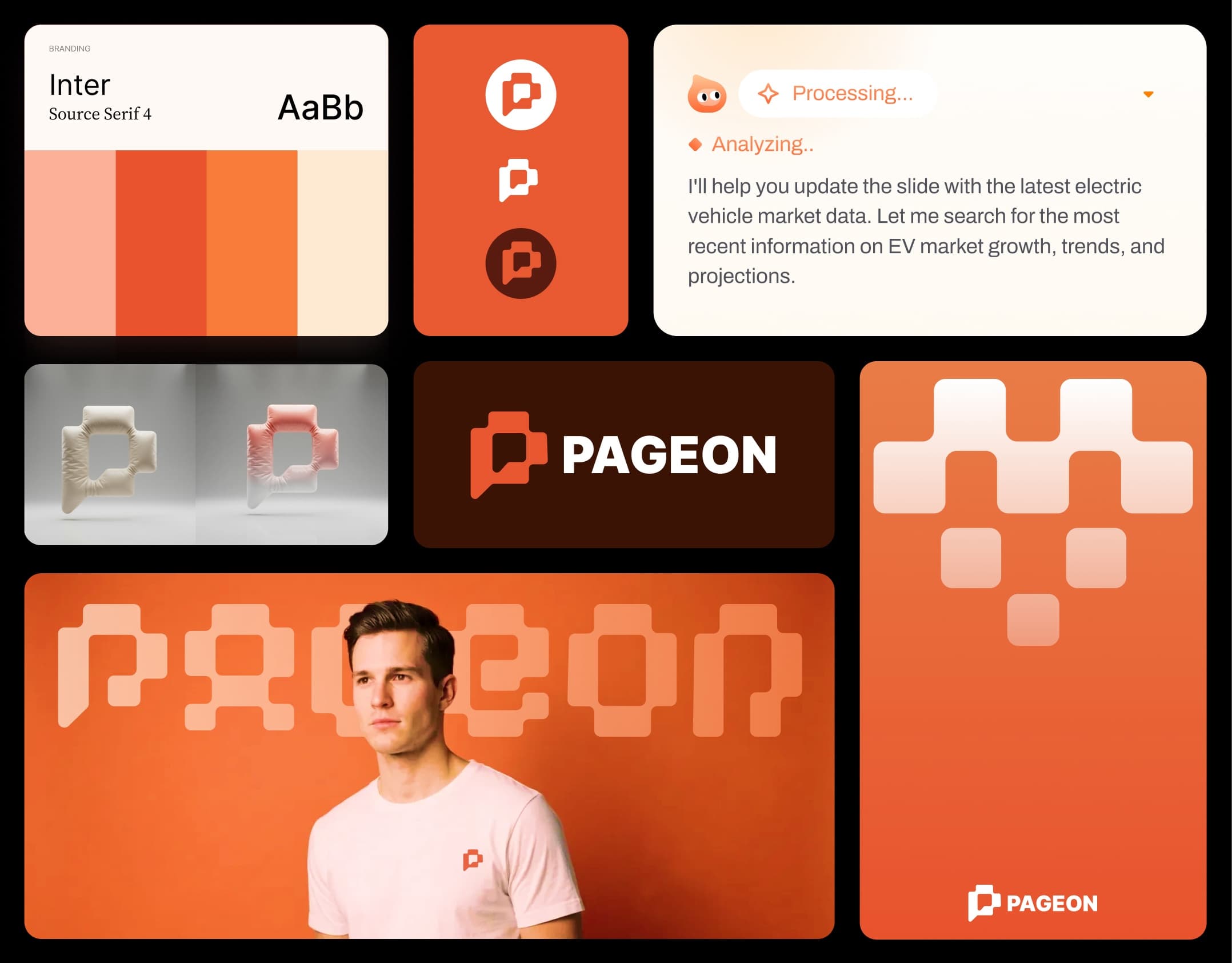
Pageon logo design